Graphics & Illustrations
〰️
Graphics & Illustrations 〰️
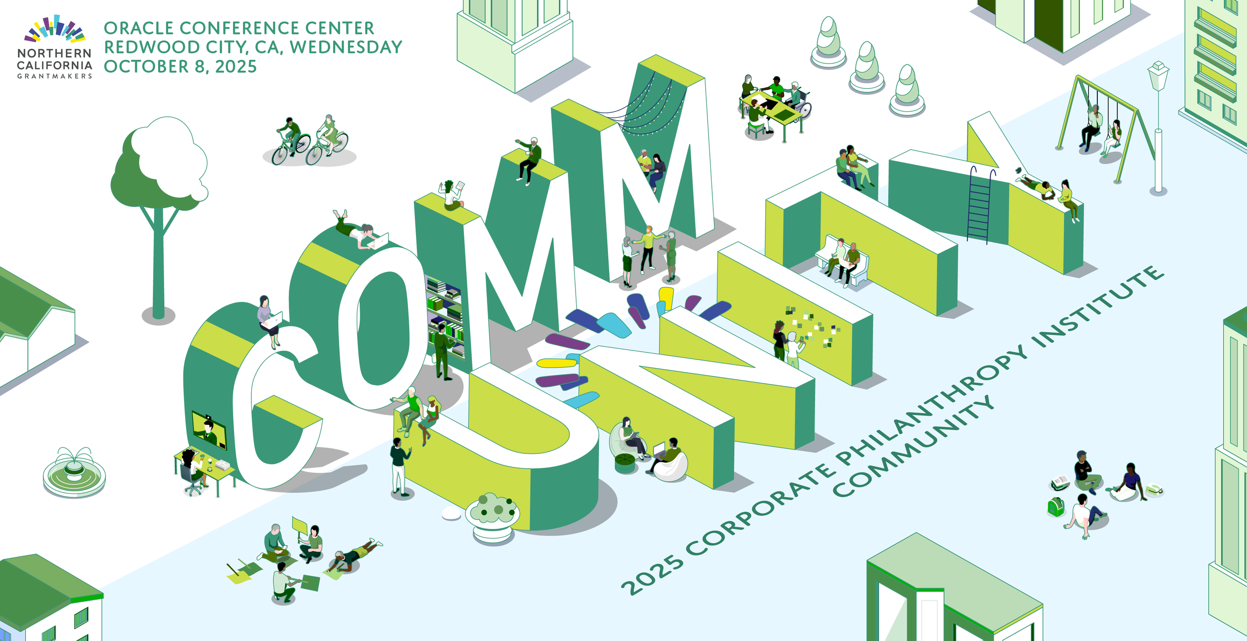
2025 Corporate Philanthropy Institute: Community
Conference Brand Development & Design | Northern California Grantmakers

2025 Annual Conference: Becoming our Vision
Conference Brand Development & Design | Northern California Grantmakers
Northern California Grantmaker’s 2025 Annual Conference was a full day, in-person conference that featured keynote sessions, the signature Great Debate event, breakout sessions, book signings, luncheons, networking events, performing artists, and more. Brand development encompassed designing geometric floral cutouts, cutting the white negative space that contrasts the Redwoods anchor photo, and sourcing a modern font that conveys a connection to the past and future. Design and graphics for this project included: conference logo, badge design, posters and signage for each event, website banners, session and speaker spotlights, social media campaign materials, and branded slide decks.
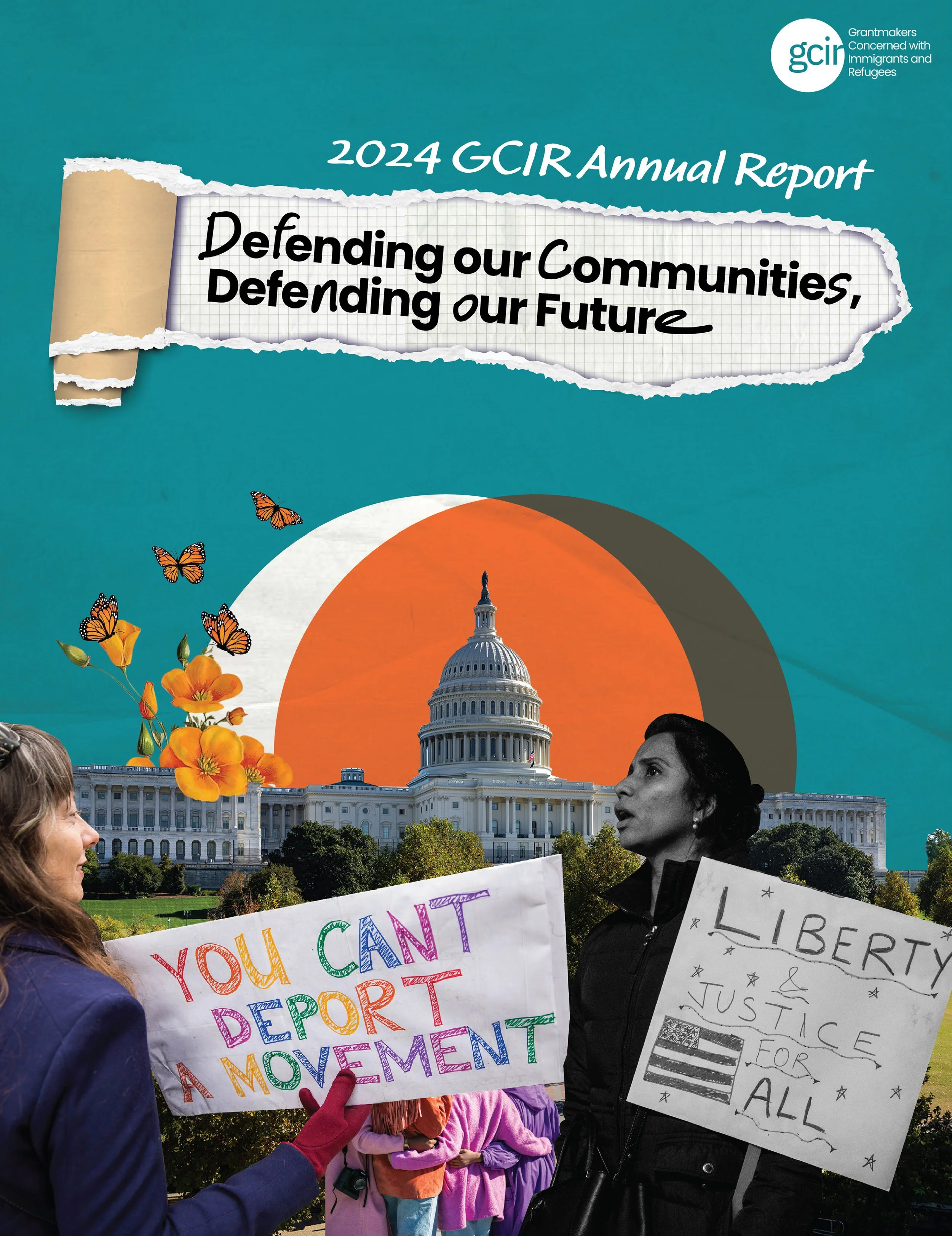
2024 GCIR Annual Report: Defending our Communities, Defending our Future
Annual Report | Grantmakers Concerned with Immigrants and Refugees
Grantmakers Concerned with Immigrants and Refugees focuses on strategic opportunities to move money and power to immigrant and refugee communities and galvanizes funders to resource a robust immigration and refugee rights power-building ecosystem. For this report, GCIR sought a collage motif that represents a gathering of people, ideas, and things. This 14-page annual report of GCIR’s work in 2024 was made for online distribution.

Michigan: Newcomers and Neighbors
One-pager | Grantmakers Concerned with Immigrants and Refugees
In 2024, Grantmakers Concerned with Immigrants and Refugees hosted their annual conference in Detroit, Michigan. Accompanying their conference and promoting awareness of the migrant population in Michigan, GCIR sought to distribute a two-pager with data visualizations that examines various demographic aspects of the immigrants and refugees who call Michigan home, the ramifications of Michigan's position as a border state, and the ways in which immigrants, refugees, and asylum seekers are strengthening Michigan's communities. See the full two-pager.
2024 Corporate Philanthropy Institute: Threading the Needle
Conference Brand Development & Design | Northern California Grantmakers
Northern California Grantmaker’s 2024 Corporate Philanthropy Institute hosted a full day, in-person conference that was themed, “Threading the Needle.” The gathering featured keynote sessions, breakout sessions, networking events, performing artists, and more. Brand development encompassed designing a logo and brand with thread motifs. The logo was also adapted for both light and dark themes, as seen below. Design and graphics for this project included: conference logo, badge design, posters and signage for each event, website banners, session and speaker spotlights, and social media campaign materials.

2024 Annual Conference: Imagine & Act
Conference Brand Development & Design | Northern California Grantmakers
Northern California Grantmaker’s 2024 Annual Conference was an in-person gathering that was themed, “Imagine & Act.” The gathering featured keynote sessions, the signature Great Debate event, breakout sessions, luncheons, networking events, performing artists, and more. Brand development encompassed designing a logo and brand that illuminates imagination, creativity, and playfulness. Design and graphics for this project included: conference logo, badge design, posters and signage for each event, website banners, session and speaker spotlights, and social media campaign materials.


Cafe Lola’s
Logo | Cafe Cola’s
Cafe Lola’s, coming soon to Brooklyn. Lola is the owner’s cat, and this logo was designed to capture her unique personality.
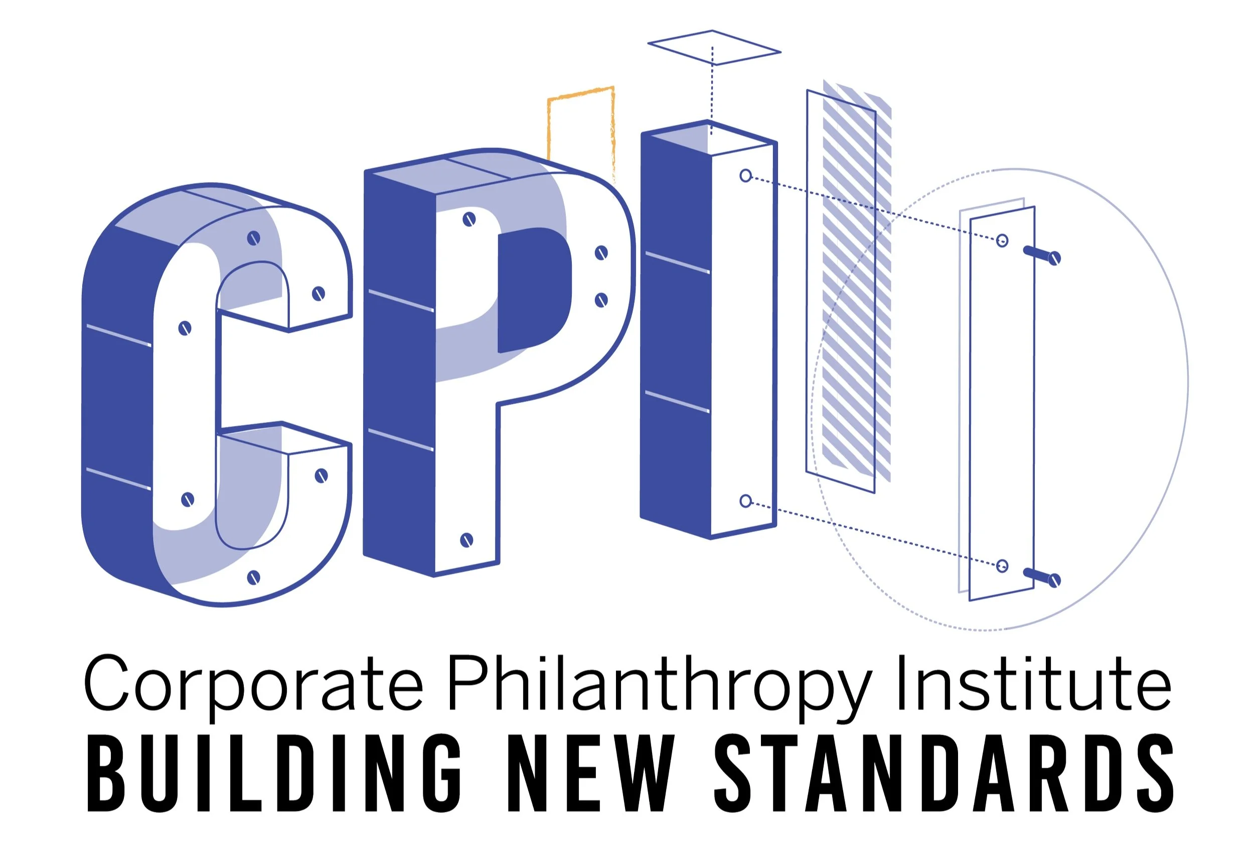
2023 Corporate Philanthropy Institute: Building New Standards
Conference Brand Development & Design | Northern California Grantmakers
Northern California Grantmaker’s 2023 Corporate Philanthropy Institute hosted a full day, in-person conference that was themed, “Building New Standards.” The gathering featured keynote sessions, breakout sessions, networking events, performing artists, and more. Brand development encompassed designing a logo that embodied the sentiment of deconstruction and re-construction. Design and graphics for this project included: conference logo, badge design, posters and signage for each event, website banners, session and speaker spotlights, and social media campaign materials.

We Continue with Love: Looking Back on a Year of Organizing Philanthropy for Queer and Trans Liberation
Recap Report | Funders for LGBTQ Issues
This report illustrated Funders for LGBTQ Issue’s 2022 work to enhance the well-being of lesbian, gay, bisexual, transgender and queer communities, promoting equity, and advancing racial, economic and gender justice. This 14-page recap was made to print and distributed at events. View the full report.
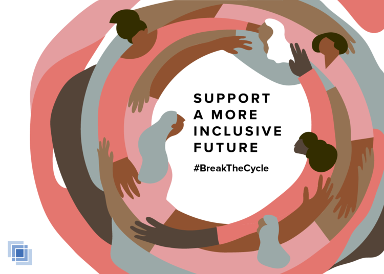
Support a More Inclusive Future
Fundraising campaign material & calendar cover | South Asian American Digital Archive (SAADA)
SAADA seeks to document, preserve, and share South Asian American experiences. For this annual fundraising campaign “Support a More Inclusive Future,” illustrated materials that were adapted for different webpages, social media, and the 2020 calendar cover.

Discover Community Café
Logo | Discover Community Café
Discover Community Café is a new social enterprise based in Oakland that partners with women facing barriers to employment through an apprenticeship program. Their work aims to empower the apprentices through skill-building, sustainable wages, and professional growth opportunities. I worked with the founder to create a logo that represents the comfort and nourishment of being in community with people and nature.

The Hidden Histories of South Asian Chicago
Event promotion material | South Asian American Digital Archive (SAADA)
“The Hidden Histories of South Asian Chicago” was a gala event celebrating 140 years of South Asian American history in Chicago. For the marketing campaign, the digital materials created were adapted for different webpages and social media.

Bay Area Philanthropy Holiday Party
Event promotion material & event signage | Northern California Grantmakers
This graphic was for the annual Bay Area Philanthropy Holiday Party, which gathers hundreds of philanthropy practitioners and affinity groups together to celebrate the closing of the year. The digital materials created were adapted and used for social media, email banners, and printed signage.
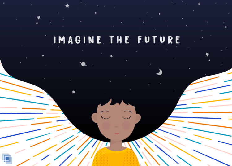
Imagine the Future
Fundraising campaign material | South Asian American Digital Archive (SAADA)
For this annual fundraising campaign “Imagine the Future,” I illustrated the digital materials that were adapted for different webpages and social media.
Shift Happens
Web-based report | Northern California Grantmakers
Fun report. Not like those other reports.
WIthout any in-person events in 2020, Northern California Grantmakers needed different visual anchors to highlight its 2020 accomplishments in its web-based “Annual (Not) Report.” “Shift Happens” was developed in response to the sudden collective jolt into the virtual working environment and reliance on our digital tools. It’s also a play on the phrase “sh*t happens.” Here, I developed the concept and animated keyboard buttons for NCG’s 2020 milestones that accompanied the report’s text.

Community Jar
Community Jar, a digital organizing community, promoted a social justice slate for the 2020 election and focused on Californian propositions. I created social media posts with different themes for each prop and presented information (pros, cons, supporters, opposition, funders, history) in carousel format.
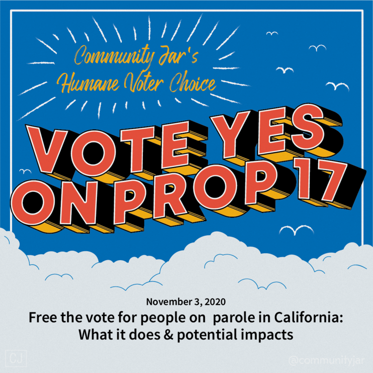
CA Proposition 17
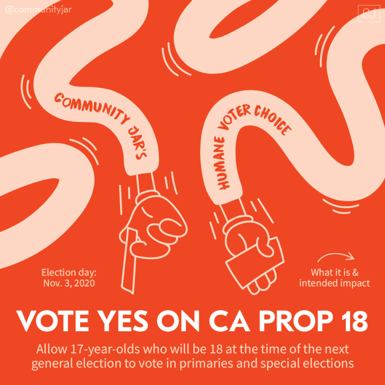
CA Proposition 18

CA Proposition 21
Reviving the California Dream
Presentation deck | Better California
Better California is an initiative to organize California’s philanthropic community towards a more just and equitable future. I created this slide deck used in the initiative’s early stages. It was presented to leaders of California’s biggest foundations such as The California Endowment, The San Francisco Foundation, Women’s Foundation of California, and others. Applications used: InDesign, Photoshop, Powerpoint

Full Cost Project
Infographics | Philanthropy CA
The Full Cost Project seeks to shift funder behaviors and beliefs toward their grantees for longterm nonprofit sustainability. The program director assigned me three different survey results and I was tasked to visualize them. The infographics were based off a post-workshop survey and used for social media and included in newsletters. Applications used: Illustrator

Status of Silicon Valley Nonprofit Spaces & Facilities
Report | Nonprofit Displacement Project
These pages were pulled from a report from the Nonprofit Displacement Project and based off a survey conducted by Harder+Co. I extracted the research’s biggest data points, designed the layout the report, and generated visual representations that reflect gentrification’s rippling effects on Bay Area nonprofits and the communities they serve. Applications used: Illustrator, InDesign, Excel
